Menu
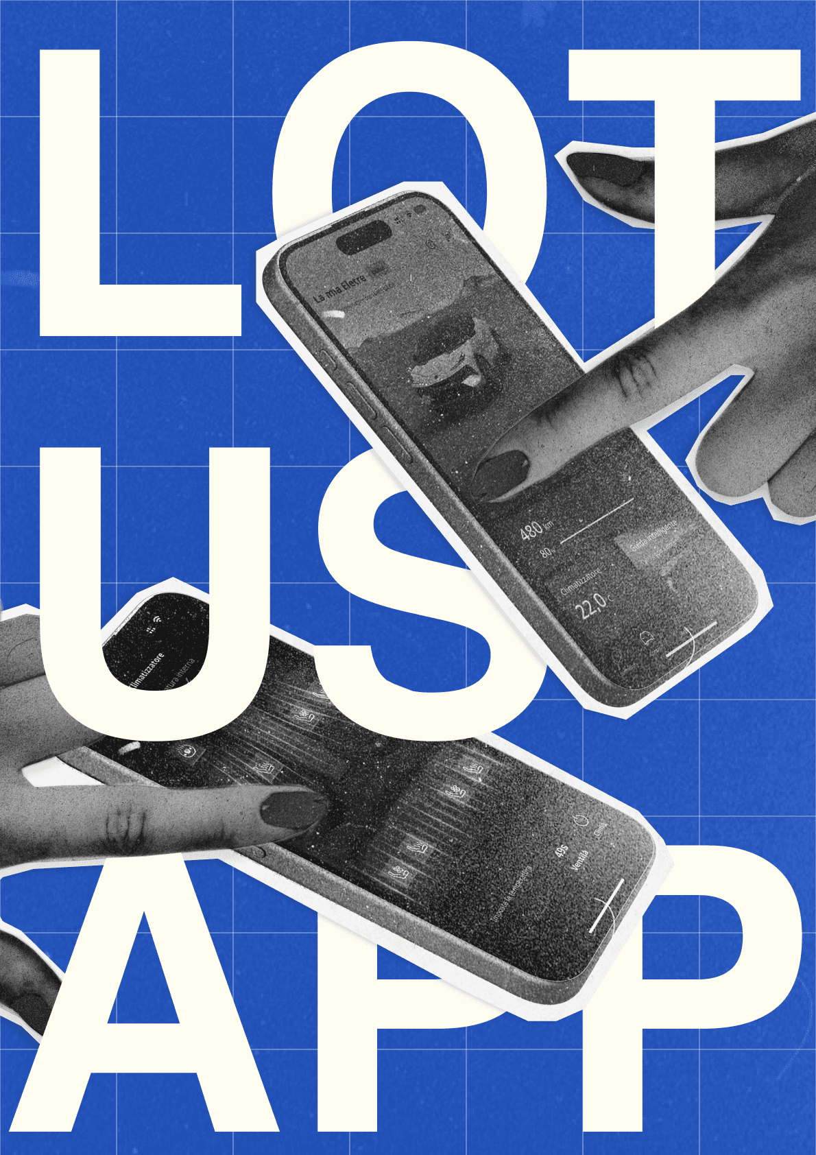
Lotus App
Lotus App
Lotus App
Lotus App
The Lotus Cars app, originally developed for the Chinese market, was directly translated into English for EU users. This raised concerns about copywriting inconsistencies and usability issues due to regional differences. Development and Product Teams sought my support to address these challenges.
Company
Lotus Cars
Role
Sr. UX/UI Designer
Location
Frankfurt
Year
2022 - 2023

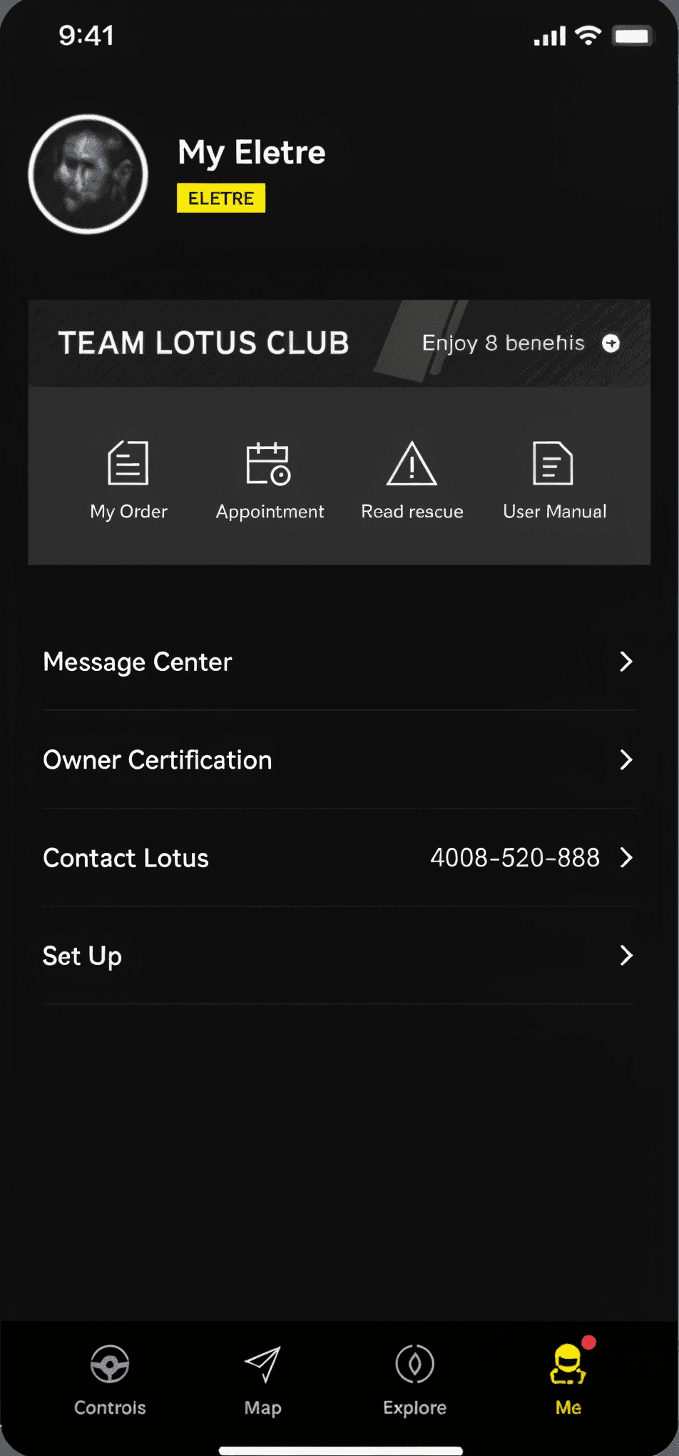
Initial state of the app


Leading the user test
Leading the user test
I worked closely with the teams to refine the app for market accuracy and ensure compliance with regional usability standards. To address user flow issues, I conducted user testing sessions, supported by knowledge-sharing workshops with my team, validating improvements and ensuring the app aligned with Lotus user expectations.
My goal was to uncover real-world usability issues and to provide a comprehensive guidance to the product team.
Tools
Tools
Qualtrics
Microsoft Excel
Figma prototype
App beta from Dev team
Metrics
Metrics
Success rate & Time on task
System Usability Scale (SUS)
Usability Issues Identified
User Satisfaction
Demographics
Demographics
15 Total Participants
6 Female users
5 Male users
(internal user testing)
Age group
Age group
1
9
1
4
age 21 - 30
age 31 - 40
age 41 - 50
age 51 - 60
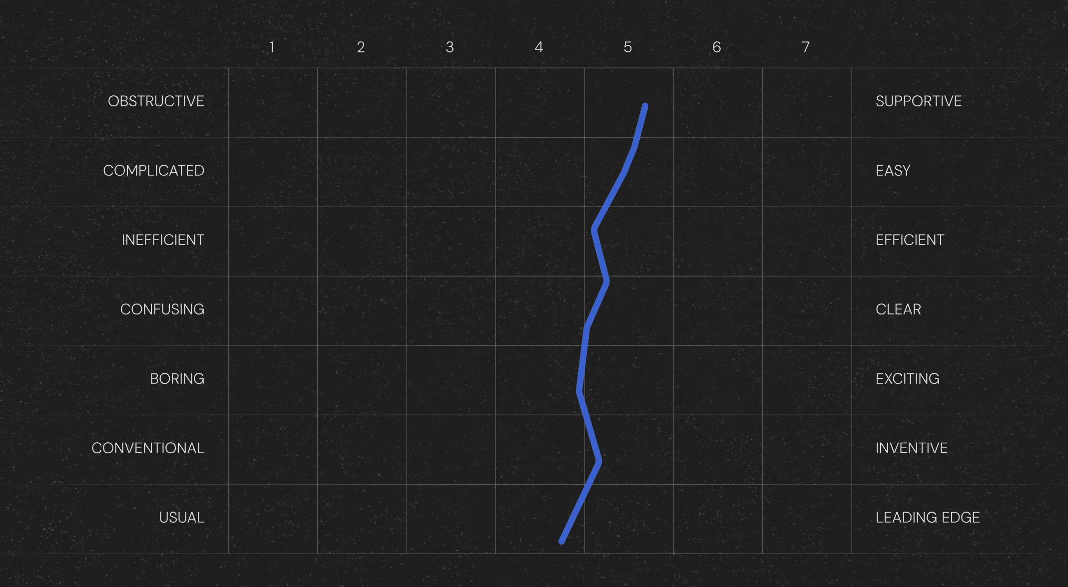
Free app exploration
Free app exploration
In the first phase, participants were encouraged to interact with the app without any guidance or specific tasks. This allowed me to observe their natural behaviour, initial impressions, and how they navigated through the interface.
This unstructured approach provided valuable insights into their instinctive interactions, highlighted areas of confusion, and revealed features that caught their attention.
Test results

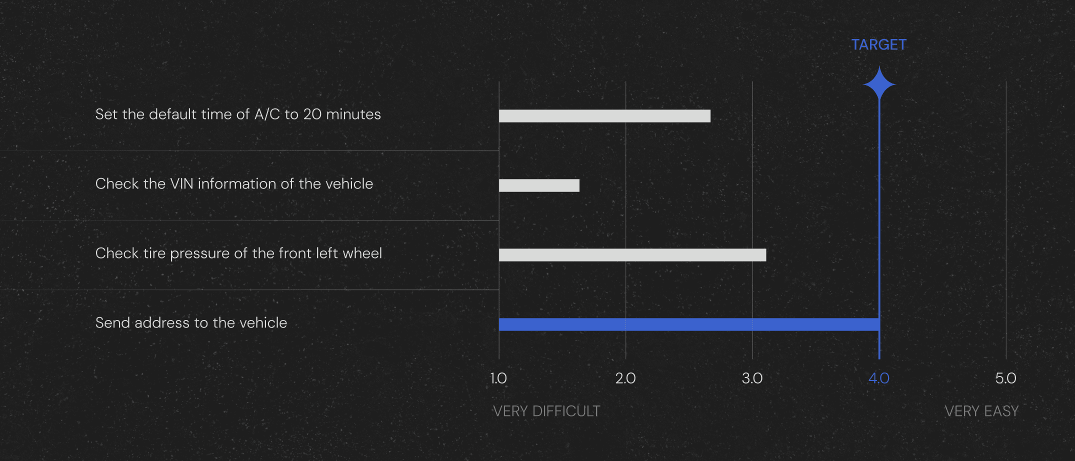
Task based test
Task based test
The second phase was crucial in assessing how effectively users could complete specific actions. It revealed challenges such as unclear workflows, inefficient navigation, and poor feature discoverability. Participants struggled with inconsistent interactions and confusing terminology, which disrupted task flows and caused frustration.
These findings highlighted the need for streamlined navigation, improved feature visibility, and a more consistent, user-friendly interface.
Test results
The new interface
Design Improvents
Design Improvents
I started by making key features more discoverable through improved visual hierarchy and clearer layouts. Terminology and labels were refined to ensure consistency and enhance user understanding, making workflows more efficient and intuitive.
Additionally, I made proposals for a polished UI design by suggesting updating iconography, adjusting page layouts, and aligning the overall aesthetic with brand guidelines, delivering a more premium and cohesive user experience.
Improvements in detail
Intuitiveness
Iconography
Brand guidelines
Future possibilities
Intuitiveness
Iconography
Brand guidelines
Future possibilities
Project results
Project results
+30% Users satisfaction
+15% Usability improved
+25 Pain points ease
Data from further user tests
Feedback
Feedback
“In about a year, the app and HyperOS have made significant strides.
The functionality is excellent, and the graphics are beautiful.”
-Andrea, App store user
Next
Next
The world's first transformable all-electric crossover, transitioning from an SUV to a pickup with interiors resembling home spaces, had an extremely tight timeline for development.

Menu
Lotus App
Lotus App
The Lotus Cars app, originally developed for the Chinese market, was directly translated into English for EU users. This raised concerns about copywriting inconsistencies and usability issues due to regional differences. Development and Product Teams sought my support to address these challenges.
Company
Lotus Cars
Role
Sr. UX/UI Designer
Location
Frankfurt
Year
2022 - 2023
Initial state of the app
Leading the user test
I worked closely with the teams to refine the app for market accuracy and ensure compliance with regional usability standards. To address user flow issues, I conducted user testing sessions, supported by knowledge-sharing workshops with my team, validating improvements and ensuring the app aligned with Lotus user expectations.
My goal was to uncover real-world usability issues and to provide a comprehensive guidance to the product team.
Tools
Qualtrics
Microsoft Excel
Figma prototype
App beta from Dev team
Metrics
Success rate & Time on task
System Usability Scale (SUS)
Usability Issues Identified
User Satisfaction
Demographics
15 Total Participants
6 Female users
5 Male users
(internal user testing)
Age group
1
9
1
4
age 21 - 30
age 31 - 40
age 41 - 50
age 51 - 60
Free app exploration
In the first phase, participants were encouraged to interact with the app without any guidance or specific tasks. This allowed me to observe their natural behaviour, initial impressions, and how they navigated through the interface.
This unstructured approach provided valuable insights into their instinctive interactions, highlighted areas of confusion, and revealed features that caught their attention.
Test results
Task based test
The second phase was crucial in assessing how effectively users could complete specific actions. It revealed challenges such as unclear workflows, inefficient navigation, and poor feature discoverability. Participants struggled with inconsistent interactions and confusing terminology, which disrupted task flows and caused frustration.
These findings highlighted the need for streamlined navigation, improved feature visibility, and a more consistent, user-friendly interface.
Test results
The new interface
Design Improvents
I started by making key features more discoverable through improved visual hierarchy and clearer layouts. Terminology and labels were refined to ensure consistency and enhance user understanding, making workflows more efficient and intuitive.
Additionally, I made proposals for a polished UI design by suggesting updating iconography, adjusting page layouts, and aligning the overall aesthetic with brand guidelines, delivering a more premium and cohesive user experience.
Improvements in detail
Intuitiveness
Iconography
Brand guidelines
Future possibilities
Project results
+30% Users satisfaction
+15% Usability improved
+25 Pain points ease
Data from further user tests
Feedback
“In about a year, the app and HyperOS have made significant strides.
The functionality is excellent, and the graphics are beautiful.”
-Andrea, App store user
Next
The world's first transformable all-electric crossover, transitioning from an SUV to a pickup with interiors resembling home spaces, had an extremely tight timeline for development.